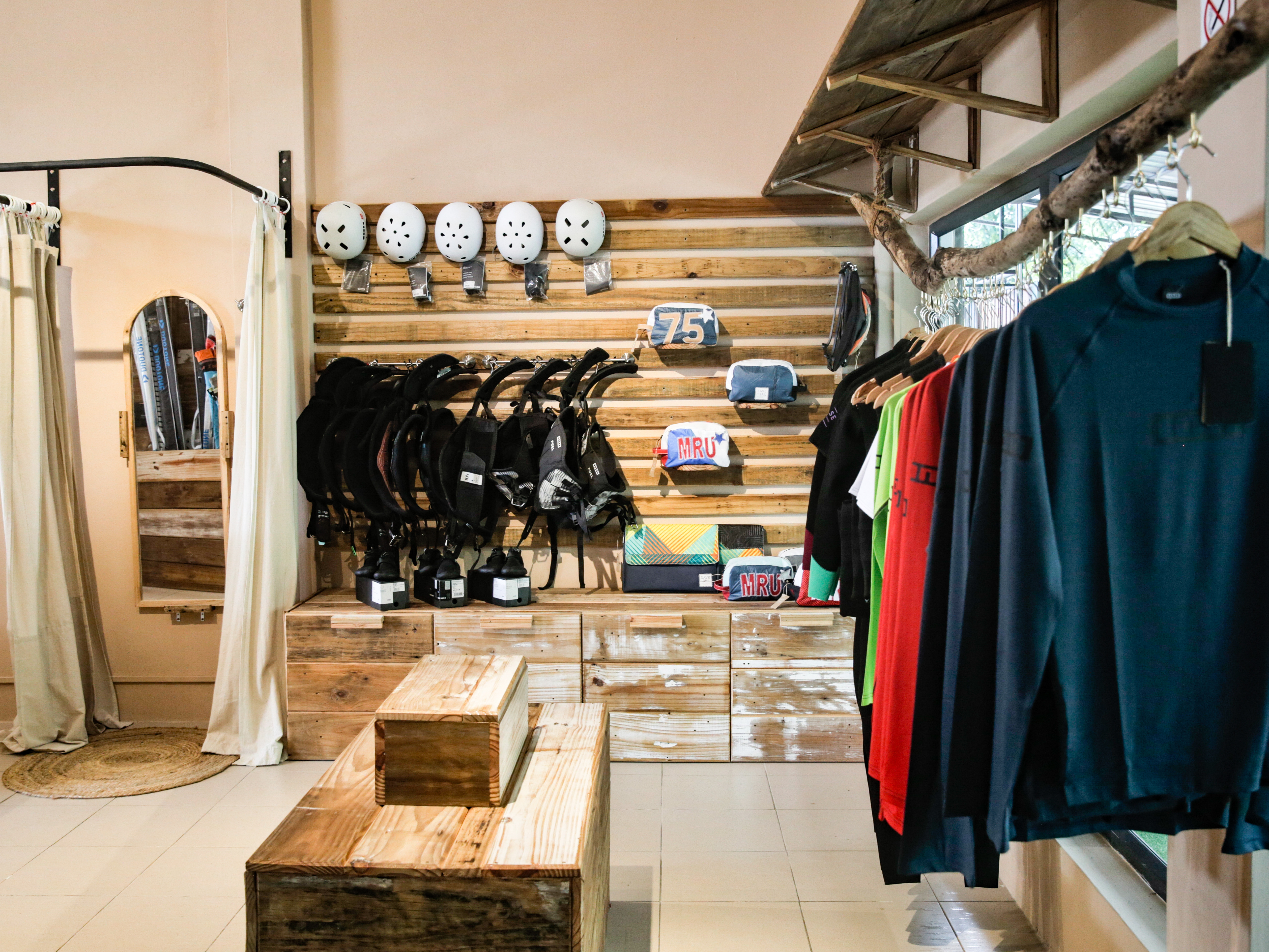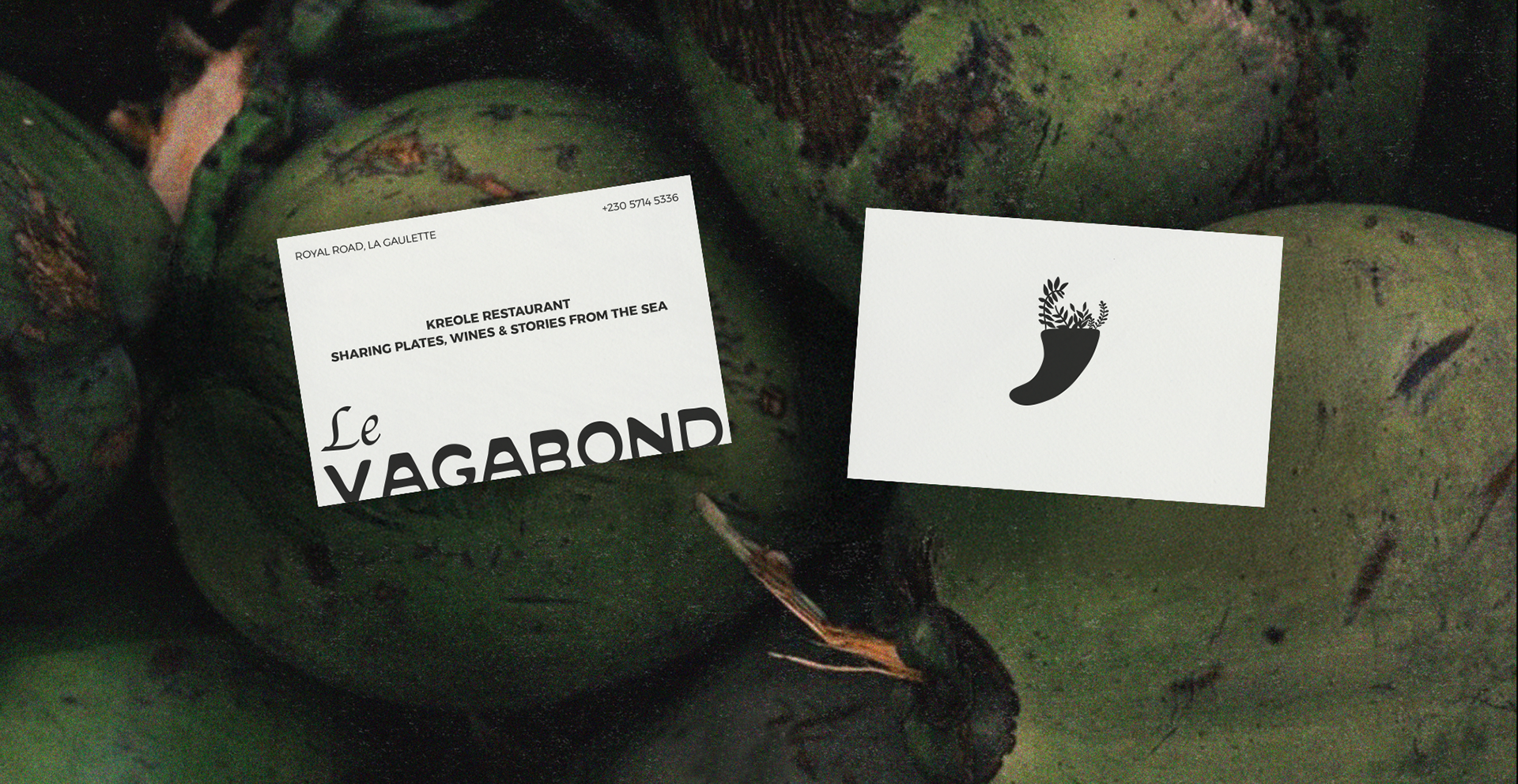
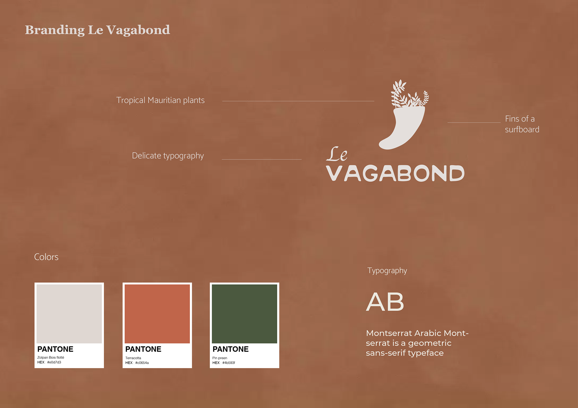
I designed the logo around a surf fin sprouting tropical flowers to capture both facets of La Gaulette’s identity: its tight‑knit surf community (because Le Morne is a very well know spot for surfing) and its lush, plant‑filled surroundings. The fin anchors the design in surf culture, while the blooming flora evokes the village’s vibrant greenery, fusing sport and environment into a single, memorable symbol.